Hibiscus Events
Logo design with variables and branding in full bloom!
When Hibiscus Events approached us, their brief was both clear and beautifully considered: inspired by the hibiscus flower - vivid, graceful and elegant, with a reminder to celebrate the here and now.
As a boutique event planning start-up based in West Sussex, Hibiscus Events designs experiences ranging from intimate gatherings to large-scale events. Their approach is deeply personal, meticulous and values-led, with a strong commitment to supporting local communities and embracing conscious, sustainable practices. The brand needed to reflect all of this, without feeling overworked or overly decorative.
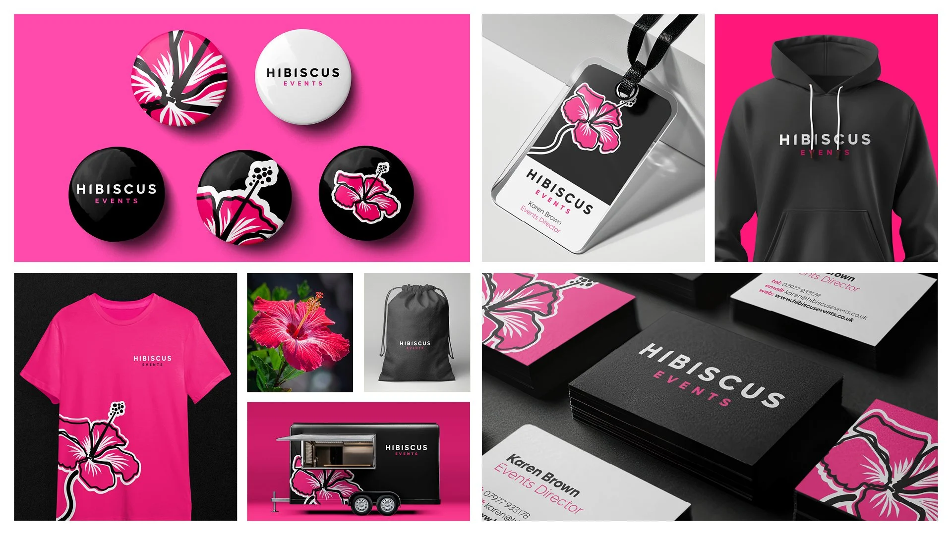
At the heart of the identity is a bespoke illustrated hibiscus. Rather than relying on a generic floral motif or a stock image, we created the flower as an expressive illustration, using brush strokes to introduce movement and grace. This approach gave the mark an organic quality, capturing the idea of presence that sits at the core of the brand.
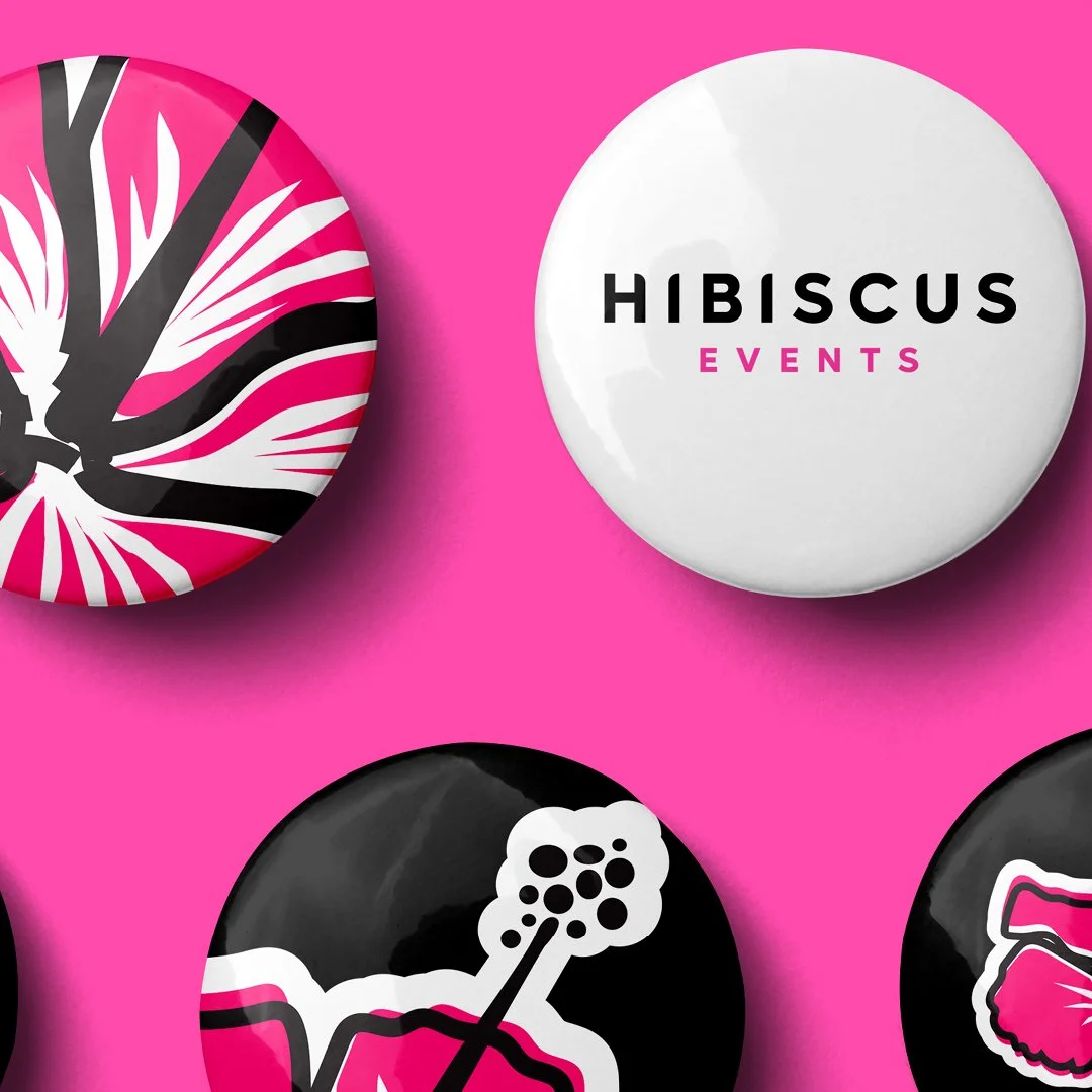
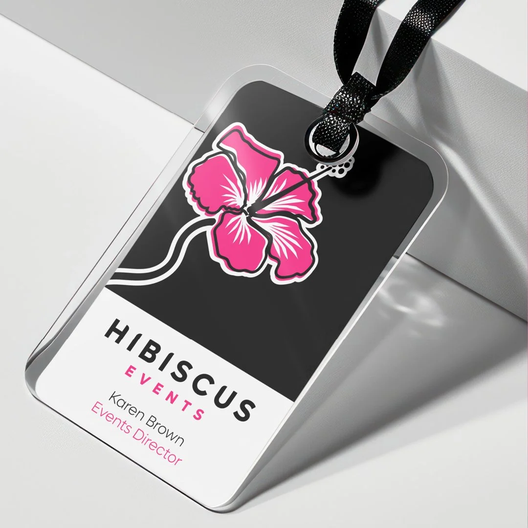
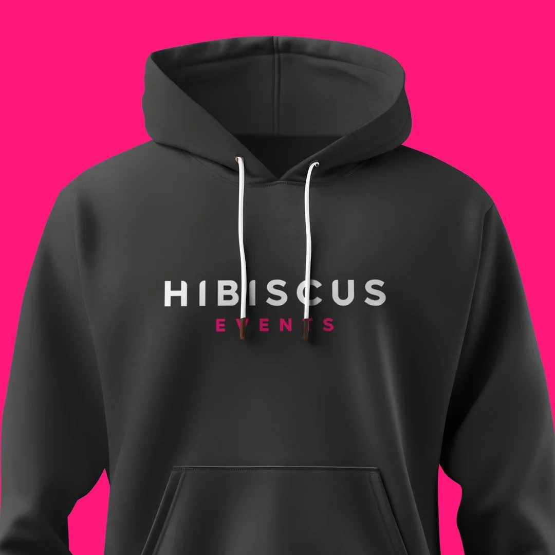
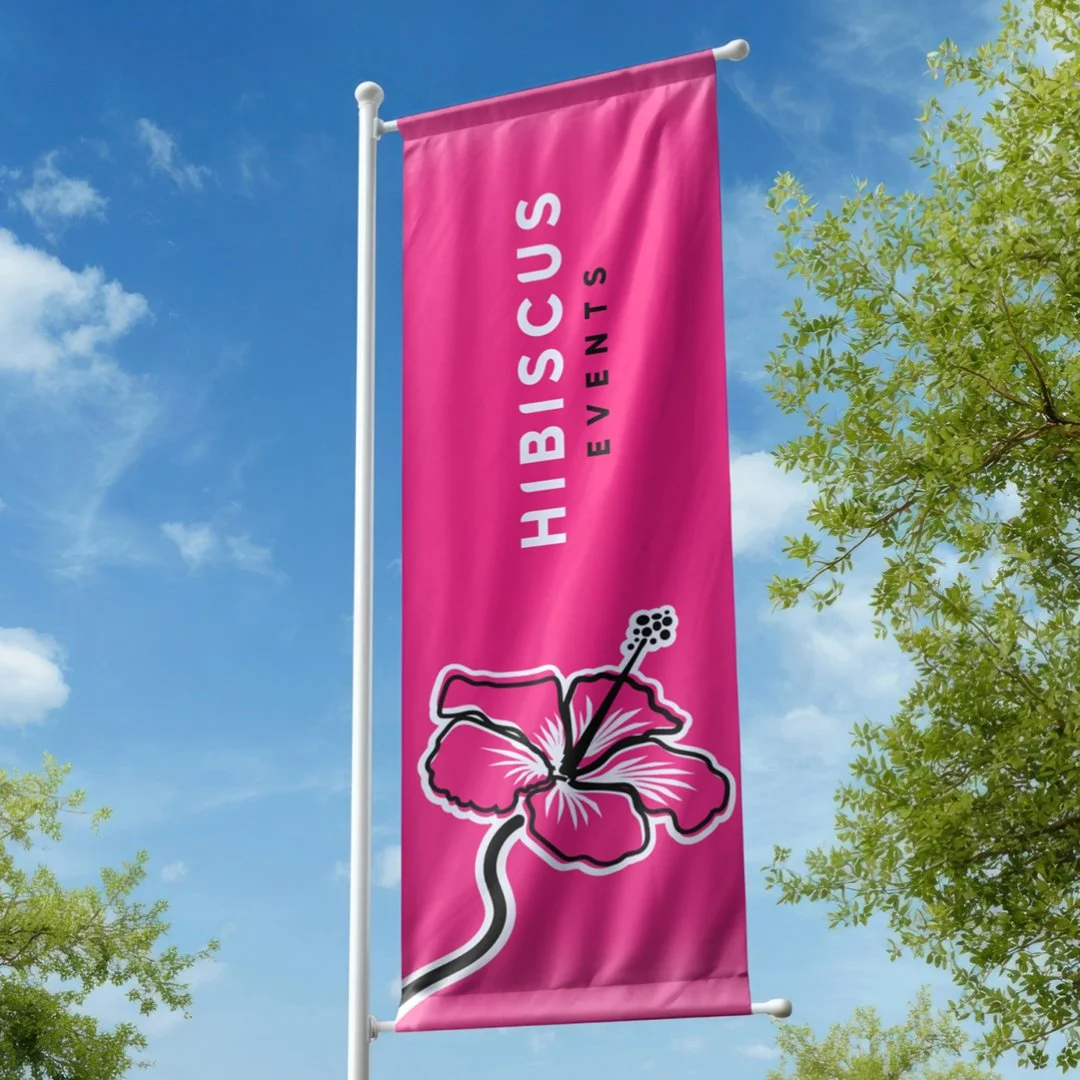
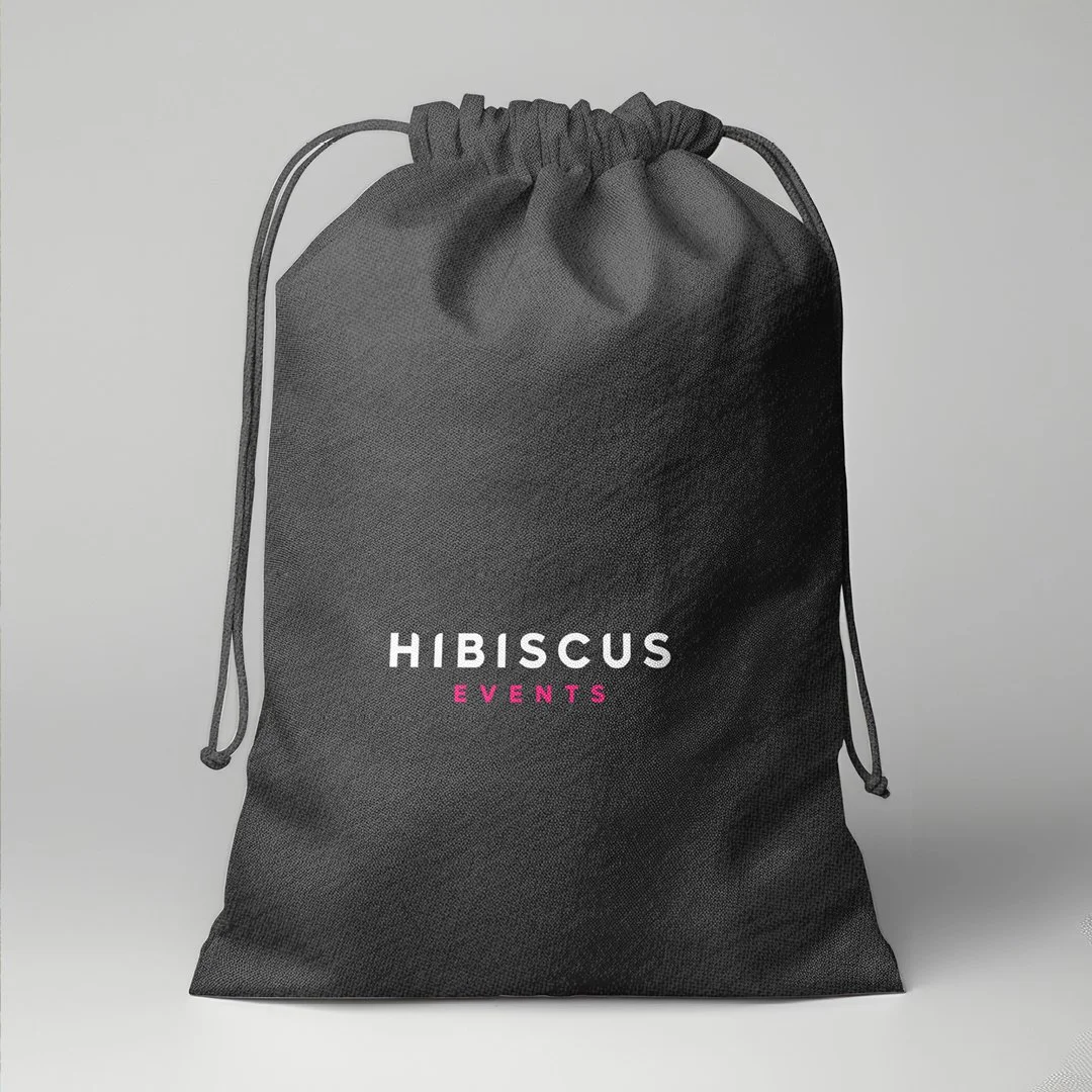
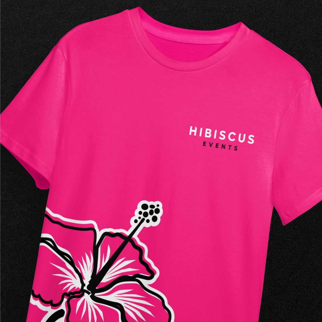
To balance this illustration, we paired it with a clean sans-serif logotype. Subtle softening on selected corners of the typography introduced warmth and originality, ensuring the logo felt distinctive yet refined. The contrast between the fluid illustration and the structured typography creates a brand that feels both elegant and confident.
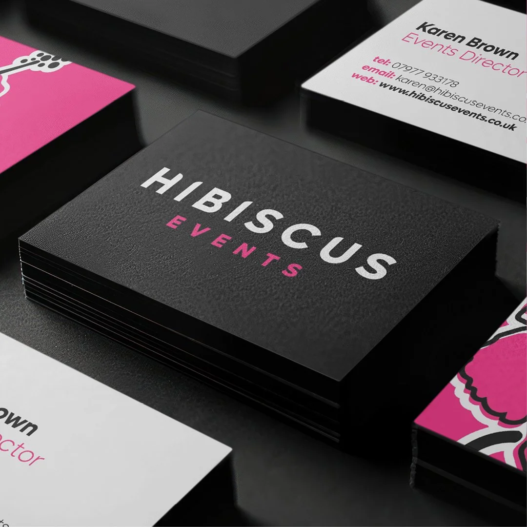
The resulting identity system was designed to flex effortlessly across applications from business cards to large-scale graphics while remaining instantly recognisable. Bold colour, strong contrast and a clear visual hierarchy allow the brand to scale without losing its personality.
Ultimately, the Hibiscus Events brand is a celebration of creativity, care and meaningful experiences brought to life through thoughtful design choices that honour both beauty and intention.