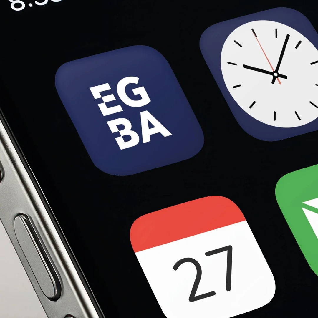
Logo + Brand for EGBA
The East Grinstead Business Association (EGBA) discussed a refreshed visual identity; the real challenge wasn't creating a logo. It was discovering what the organisation already represents: a thriving network of independent businesses, long-standing relationships, local heritage and genuine community pride.
Before any design work began, I spent time considering the organisation's narrative. What makes EGBA different? What keeps businesses engaged? What role does it play within the town?
The answer was clear: connection.
The concept is centred around connection. And it already had this…
Strong Independent Businesses
Established Relationships
Real Heritage
And strong community pride
With that in mind, the new identity needed to feel established yet progressive. Strong enough to stand alongside larger organisations, while still reflecting the character and independence of the businesses it represents.

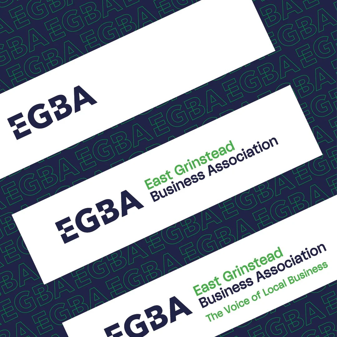
The solution began with a bold, distinctive wordmark. Rather than relying on generic business imagery, the design focuses on creating an ownable identity that can become instantly recognisable across multiple touchpoints. A stronger colour palette reinforces confidence and visibility, while carefully selected typography provides both character and flexibility.
However, the most important element isn't the logo itself.
The identity was intentionally designed as a system of variables rather than a single fixed mark. Just as the EGBA is made up of many different businesses, sectors and personalities, the brand can adapt and evolve while remaining unmistakably connected. From events and communications to future initiatives and campaigns, the visual language provides consistency without becoming restrictive.
This approach allows the brand to reflect the diversity of its members while maintaining a unified presence. Every application reinforces the same message: this is a connected, active and engaged business community.
Good branding should never be decoration. It should communicate the meaning behind it.
For EGBA, the new identity represents far more than a visual refresh. It provides a framework for recognition, engagement and future growth, helping strengthen the visibility of the organisation and the businesses behind it.
Because in the end, it was never just about creating ‘just a logo’. It was about creating a visual identity that reflects existing connections and future growth to build even stronger ones.
The Brief
EGBA isn't just about networking. It's about connection. It's about championing local businesses, strengthening relationships, and creating a collective voice that represents the heart of East Grinstead.
The new identity needed to capture that story, and the logo needed to:
Reflect EGBA's role as The Voice of Local Business
Visually represent connectivity between businesses, members and the wider community
Work as a flexible system across events, membership communications, socials, web and print
Celebrate the town's heritage while feeling relevant for future generations
Create a recognisable identity that could evolve alongside new initiatives and campaigns
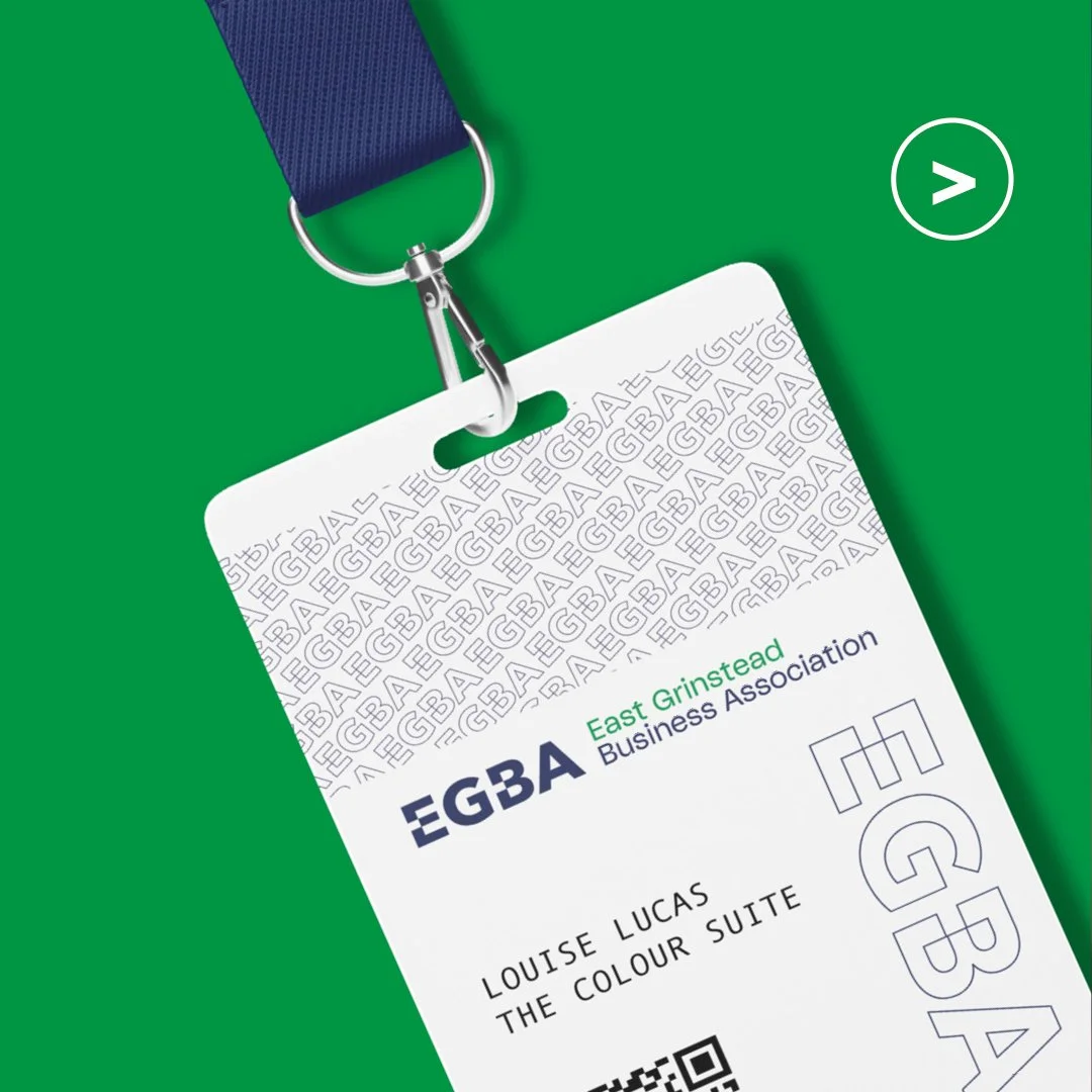
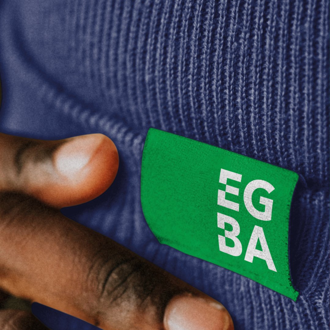
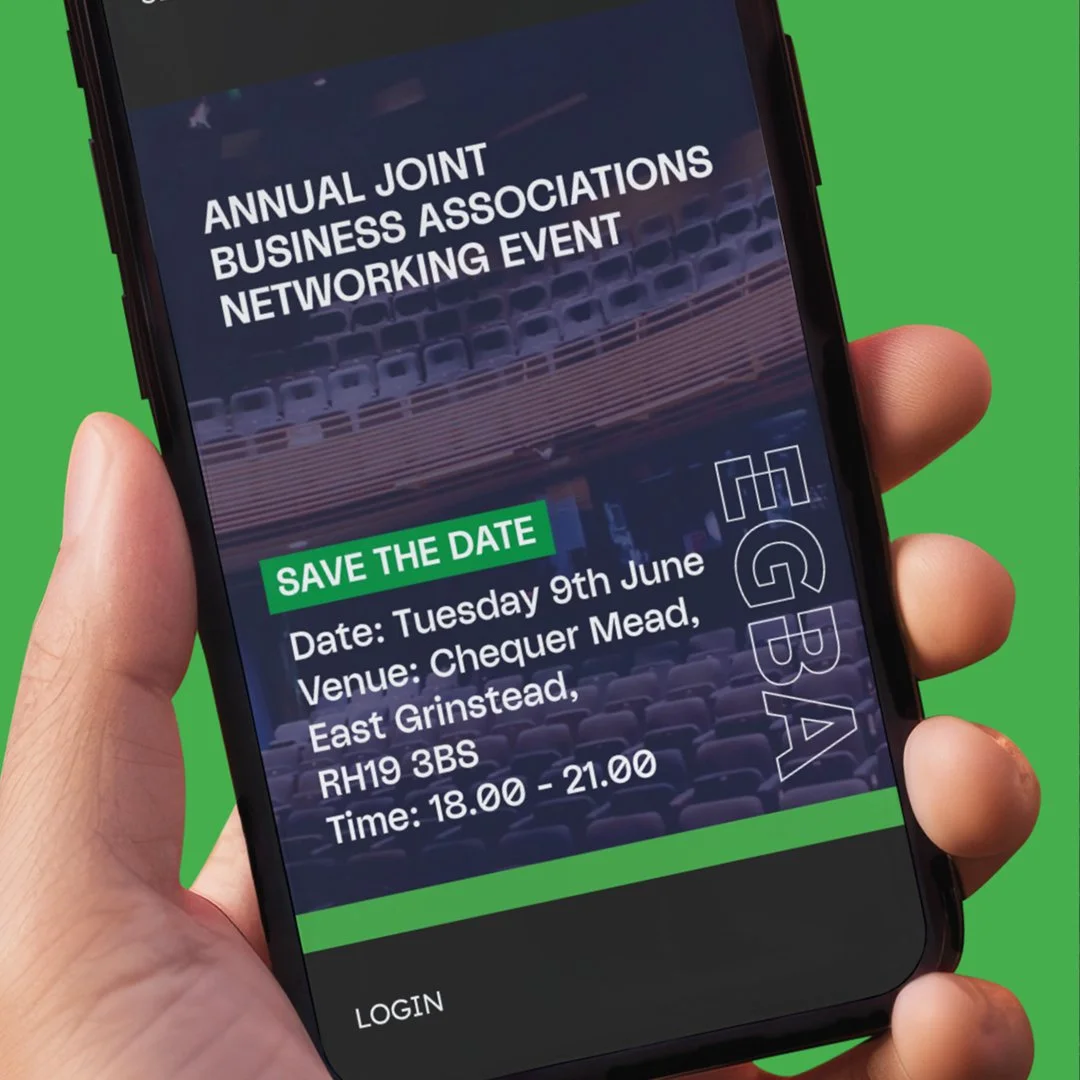
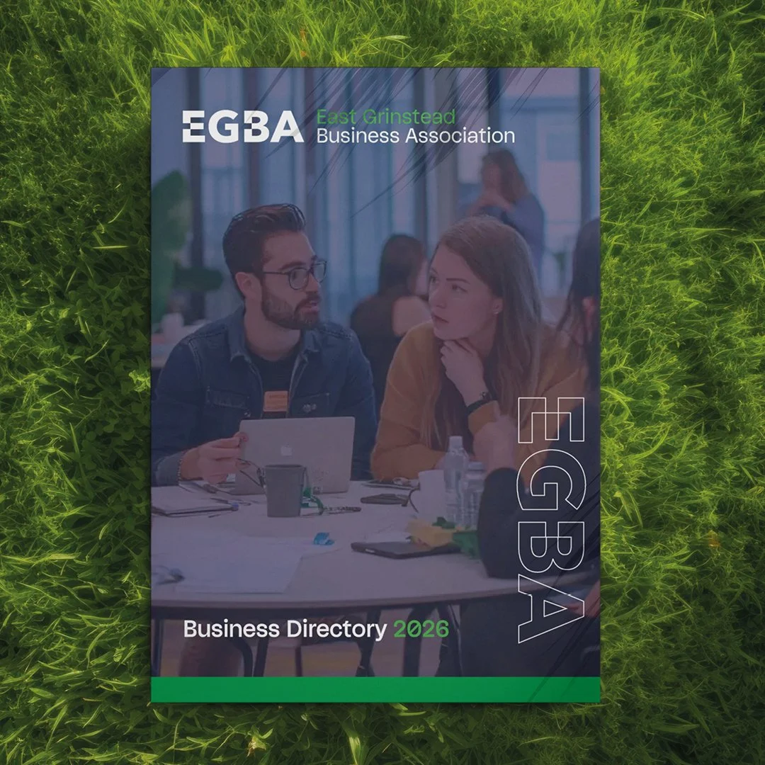
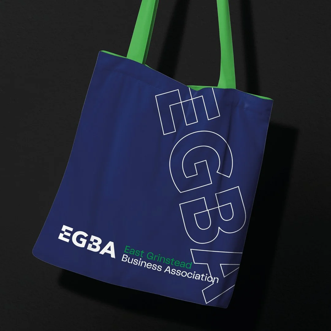
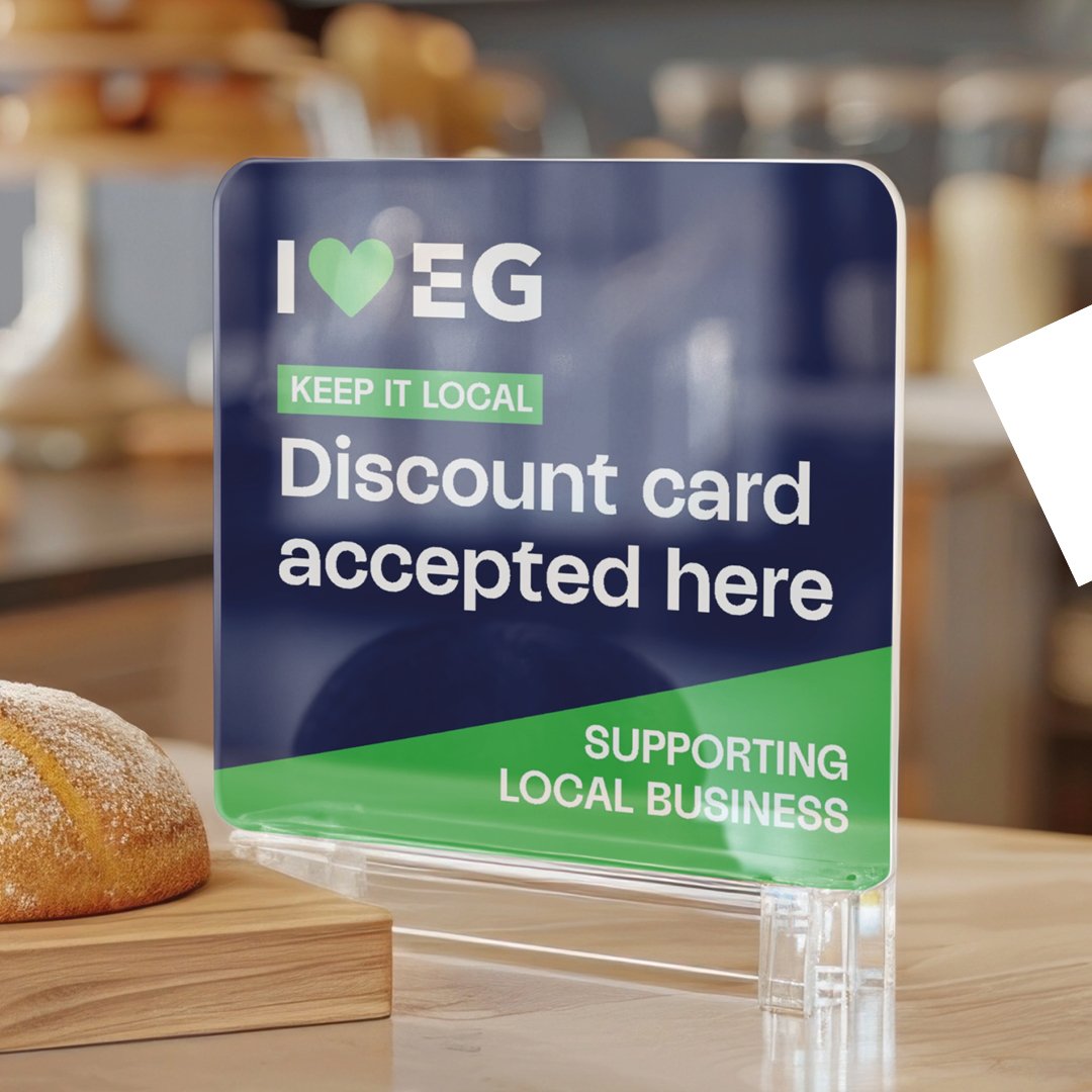
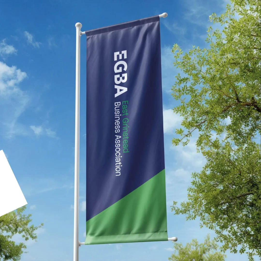
Rolling out the brand
The new identity was designed as a connected brand system, allowing EGBA to communicate confidently across multiple touchpoints while maintaining a strong and recognisable presence. From networking events and newsletters to social media campaigns, membership materials and future initiatives, every element works together to reinforce the same message.
The adaptable logo suite, distinctive wordmark and colour-coded communications provide flexibility without losing consistency. This creates a visual language that reflects the diversity of East Grinstead's business community while keeping members connected under one shared identity.